Role
Visual Designer
Logo design, visual identity, layout design, packaging, print materials, and card game components.
Brand Identity • Print • Packaging • Product Experience
A conceptual entertainment brand system connecting visual identity, print materials, packaging, and card game components into one cohesive user-facing product experience.
The project connects identity design, printed communication, packaging, and game materials into a consistent entertainment product experience.
Role
Logo design, visual identity, layout design, packaging, print materials, and card game components.
Project Type
A conceptual entertainment brand with a connected card game product called Secret.
Tools
Adobe Illustrator, Adobe Photoshop, and Adobe InDesign for identity, mockups, and layout production.
Focus
Consistent hierarchy, recognizable visual language, readable instructions, and usable product touchpoints.
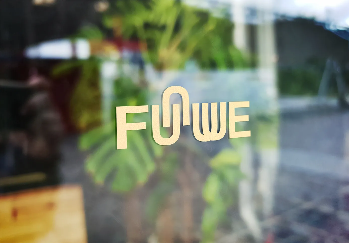
Funwe is a conceptual brand identity project focused on creating a playful and recognizable visual system for an entertainment company and its card game product, Secret.
The system includes logo design, brand manual layout, business cards, posters, packaging, game cards, board design, and manual design. Instead of treating each item as a separate graphic, I designed them as connected parts of one system.
The goal was to create a consistent brand experience across corporate identity and product touchpoints, while keeping the game materials readable, engaging, and easy for players to recognize and use.
The Funwe system needed to function as a company identity, promotional system, and playable product experience at the same time. Each format had a different communication purpose and viewing distance.
The main challenge was balancing visual personality with practical readability, especially for game components that players need to scan and understand during use.
The project goal was to make the brand recognizable across business cards, posters, manuals, packaging, cards, and the game board while keeping each piece clear for its specific use.
From a design perspective, the system needed visual rhythm, clear hierarchy, repeatable styling, and product materials that feel connected rather than fragmented.
I considered both brand-facing and user-facing needs: how the identity appears professionally, how the product looks on the shelf, and how players interact with the game materials.
01
Need to quickly recognize Funwe as a playful, entertainment-focused brand through logo, color, typography, and promotional tone.
02
Need game cards, board information, and instructions that are readable, scannable, and visually organized during play.
03
Need packaging, manual, cards, and identity elements to feel like one complete product rather than disconnected design pieces.
I organized the project into three connected layers: the company brand identity, brand communication materials, and the card game product system.
This structure helped the visual language stay consistent while allowing each output to serve a different purpose: recognition, promotion, instruction, packaging, and gameplay.
The final outcome shows how one visual identity can extend across physical touchpoints and user-facing game materials.
The process followed a system-based workflow: define the identity, apply it to communication pieces, then extend it into the playable product experience.
01
Created the Funwe identity direction through logo design, color tone, typography, and visual personality.
02
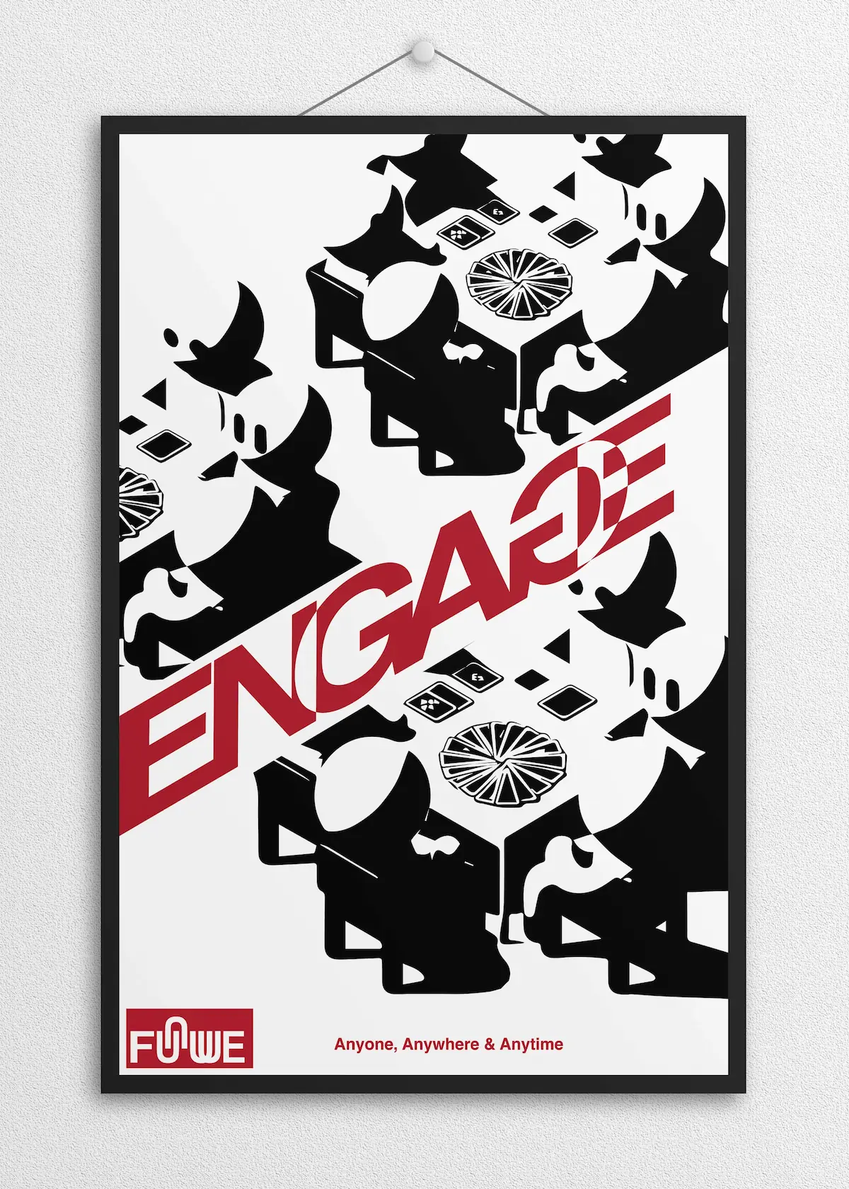
Applied the identity to business cards, posters, and brand manual layouts to keep the visual language consistent.
03
Extended the brand into packaging, game cards, board design, and the instruction manual for a complete product experience.
These horizontal cards follow the WAADA case study pattern and explain the system decisions behind the final design.
Used consistent logo treatment, color direction, typography, and layout rhythm so the identity remains recognizable across business cards, posters, manual pages, packaging, and game components.
Designed game-facing materials with clearer information levels, helping players distinguish instructions, cards, board areas, and product identity during use.
Treated packaging, board, cards, and manual as one connected experience, making the product feel complete from first impression to gameplay.
A collection of final deliverables demonstrating how the Funwe identity extends across corporate communication, packaging, and game-related product design.
The final system presents Funwe as a complete entertainment brand with a clear personality, consistent print language, and connected game product materials.
01
Consistent visual identity
02
Clear product hierarchy
03
Connected brand-to-product system